Microcopy and UI text is any text you see in the product when you’re using it.
Tooltips, button labels, menu names, icon text, error messages, confirmations. All of this text contributes to the user experience and can mean the difference between a frustrated user or a delighted user.
There might be some ‘quick wins’ here (low-handing fruit) - easy improvements that would have a big impact on the usability of TYPO3.
I had to Google for “microcopy” and understand that there is indeed room for improvement.
But I found a worrying example:
Here a button that changes its label is touted as good. IMHO a changing label is bad for assistive technologies (eg screen readers). I suggest disabling the “submit” button and adding the text “done” next to it. Or make sure the change only a visual one and have let the accessible name unchanged.
Please make sure that quick-ins don’t undermine the efforts of the BE accessibility initiative.
Thanks @masi I agree with you - I didn’t like that example either, for accessibility reasons.
It’s important that the accessibility, UX and documentations initiative all work closely to ensure a seamless, unified result. There is overlap in these areas, so we shouldn’t work in silos.
Here are a couple of articles from Norman Nielson Group, a respected thought-leader in UX:
Cool, yay. Thanks @rakel
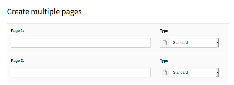
I was looking at adding multiple pages the other day, and noticed the label for adding a page title is unclear. This is a good example of an opportunity to improve microcopy.
Instead of “Page 1:” it might be “Page 1 Title” or alternatively, put placeholder text in the control that says “Title”.
Apart from that, I think this is in good hands with you and Rachel.
As far as this touches on the topic of “unified spelling” and “preferred terms”, you could also contact me as I already put some work into this, see also the “Spelling reference, preferred terms & glossary” - though in this case from perspective of docs - but I would be very happy to hand this over.
Read up on the topic “microcopy” a little and it seems to me this goes way beyond improving the text for clarity. You also have to find a tone of voice, should it be casual or more formal - actually you have to ask yourself, what kind of personality does TYPO3 itself have and how should it “talk” with its users.
Not sure if this also goes for short texts like button labels but it probably can’t hurt having this in the back of your mind.
Fascinating stuff!
I don’t remember who but someone recently asked on Twitter - do you prefer the formal German “Sie” or “Du” in the GUI (“Vous” ou “tu” in French).